Over the years of note-taking and using various IDEs, I have observed some common patterns to the colour schemes and how they interact with the cognitive load of the reader. I’ve summarised some of the key observations.
Since this is only my personal opinion, it may be different from your perception of colour.
CAUTION
Colours, especially colours of similar saturations, should never be the sole discriminator. Many high-contrasting colours to trichromats are difficult to distinguish for colour-blind people. At small scale, colours are also harder to distinguish than shapes.
Saturation is Attention
High saturation areas guide attention. They can be used to separate regions of text to make reading easier.

Too many hues could lead to cognitive fatigue
There is only so much total attention a reader has and it is delegated based on the saturation.
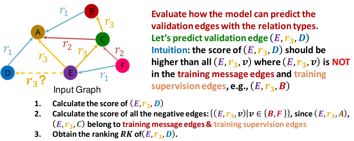
This example from Stanford’s CS224w
class shows the cognitive load required to parse a very colourful diagram:
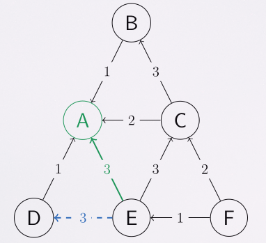
In comparison with my reprocessed version
Avoid colours that are difficult to differentiate
(My apologies for the inconsistent screenshot) This is an objection I have to some low contrast colour schemes. The similarity in hue makes colours hard to differentiate, and more cognitive power is needed to parse the text in order to create a context.
Below is the comparison of two colour schemes from Doom Emacs:
Nord:

Lantern:

Use a consistent colour scheme
This is mainly applicable to note-taking. A consistent colour scheme can help with comparison and drawing parallels.
Below is an example from CS224w notes. I try to use warm colours (orchid, brick red, orange) to label important parts of the neural network model that may be key to understanding. Less saturated colours (e.g. grey, light blue) are used for hyperparameters. Green is reserved for weights or attentions.